Trend Analysis
Overview
The purpose of this report is to understand the usage patterns of a site over time. This report does not usually produce actionable knowledge in itself, this only helps us improve our general understanding of the site. In this sense, this is only an auxiliary report.Details
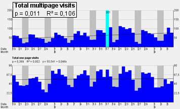
Many log analysis packages will draw you bar charts of all the different data in the world, but do you know what to think about the bars? My reports include advanced trends analysis of the data. On the left, you see a black line on both of the charts. In the above chart the line is clearly rising towards right and in the below chart the line is about level. The trends describe the overall change in the data. You will at least get a clear idea on what is direction of the development.Trends analysis is not a simple thing to do right. How do you know if the trend line describes the data reliably? This analysis also shows the significance of the trend. This is given by the p-value at the top-left corner. As a rule of thumb, if the p-value is below 0.05, you can consider the trend reasonably reliable. Factors affecting the reliability are the amount of data and the real existence of any trend in the data. For completely random data, there is no trend. If the amount of data is small, say amounts of visits for two weeks (14 data points), the amount of data could be too small to reliably determine that there is a trend in the data. My analysis takes these factors into account.
Another factor affecting trend analysis is that if there are "surprising events" (called outlier cases) in the data, they could considerably throw off the trend line for the data. In the above image, look at the tall bright cyan bar in the middle. The analysis determined this to be an outlier case. The top edge of the drawn scale here is 200 visits per day, and most days settle around 100 visits here. However, the cyan bar represents a day when there was 301 visits (the value is drawn at the top of the bar, because the real value would be outside the scale). This outlier case does not reflect normal run-of-the-mill business for the site. It could be a result of a marketing effort like a paid advertising spot or a periodic newsletter to registered customers. (In this case I know it is.) Such a special event does not accurately reflect the long-term changes on the site, so it makes sense to leave this day out when analysing the trend. Another benefit of my outlier detection is to adjust the scale of the graph for better readability.
See a full version of a sample analysis to see all the details.
In here, trends for are shown for Total multipage visits, Total one page visits (also called "bounces") and Average pages in multipage visits. I could easily add any other variable to the analysis, like visits to a certain page, usage percentage of certain link, or time spent on a certain page.
Interested in an analysis? Contact me.