Site Navigation Structure
 Overview
This report answers the following questions:- What are the most important entry points to your site?
- What are the possible navigation steps from entry points to your goal page?
- How are those navigation steps performing as compared to each other?
Details
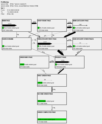
A Site Navigation Structure report lays out the logical pages of the site.A goal page is determined for the analysis (e.g. your "order completed" page) and the analysis shows all significant navigation paths leading towards the goal page from all significant entrance pages of the site. The navigational structure shown in this report comes only from the data (See Note 1), so it shows how the site really works, as opposed to design diagrams that show how the site is supposed to work.
On the left you see a scaled version of the full diagram. All arrows on the diagram are drawn on the same scale, so the diagram graphically shows the proportions of traffic flows on the site. The thickness of an arrow shows the total number of visits navigating that arrow and the numeric percentage is the relative measure for a link's performace, the percentage of visits using the link to navigate from its source page to its target page.
Spending most of your effort on your front page? Notice that on this site (a real e-commerce site!) only about one third of visitors enter the site on the front page. The majority of visitors will never even see your front page. Without active marketing, like newsletters that urge visitors to enter at the front page, the proportion of visits at the front page would be even less. Search engines like Google generally bring visitors directly to your category pages or product pages.
See the full diagram to see all the details.
Comparing time periods
Want to see how things have changed from one time period to another? Maybe you have made some changes in your site design or marketing efforts and you want to evaluate their effect.The time periods can be any two time periods. They don't have to be calendar months or weeks. However, web traffic usually shows strong periodicality. When comparing short periods of times, it is usually necessary to account for the periodicality introduced to the data e.g. by weekends. This could be done either by leaving weekends out of the data altogether, or using 7 day blocks of time to make sure that an equal proportion of time in the compared periods are occupied by weekends.
This same report can be produced so that it compares two time periods. What changes is that all numbers on the page are changed to show both periods, e.g. "51%" in a simple report will change to "51→59%". The real candy here is showing the statistical significance of the change. For example, the comparison report could read "51→59%***". Three stars will let you know that the difference is extremely significant, i.e. extremely unlikely to occur by chance alone. The significance levels are the quite commonly used: * = significance level of 95%, ** = 99% and *** = 99.9%.
See a full comparison report.
Have your site analyzed?
Want to have a similar report of your site? Contact me.Notes
Note 1: The diagram layout is really produced by the program, only from the log data and with the knowledge about a single goal page. Automated diagram layout is generally considered quite a difficult problem in computer science. This program copes with the problem by reasonable design decisions about how to structure the diagram and a couple of sophisticated algorithms to increase the readability of the data. If you would have an analyst manually draw a similar chart, there would be extraneous factors affecting his work, like existing knowledge of how sites are usually organised, and some aesthetical considerations. Because my report is 100% drawn by a program, it reflects your log data 100% and nothing else.Note 2: Many log analysis packages show you information of hits or page views. However, for answering most site design or usability questions, I think the visits are much more important. Looking at the percentage of visits tells you the percentage of visitors that are finding or using a certain link at all. Looking at percentage of page views would tell you something completely else. Suppose you have 10 visitors come to your product category page A. Only 1 of those visitors would either notice or be motivated to use link to product pages B. This one user happened to be a motivated user and he used the link 10 times to view 10 different products. Looking at page views, it would seem that perhaps 50% of hits to page A lead to page B. Looking at visits, the percentage is 10%, because 9 out of those 10 visits did not use the link from page A to page B. Which figure is more interesting?